The first three pieces were done on the concept of incorporating my abstract drawings. The drawings were not just for the backgrounds but were a part of the typography.
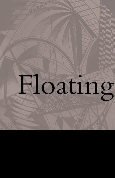
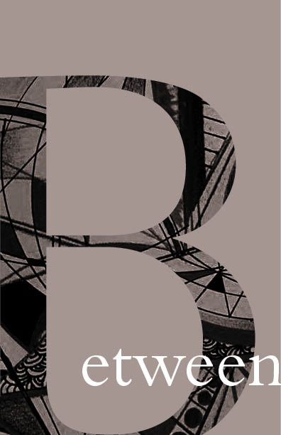
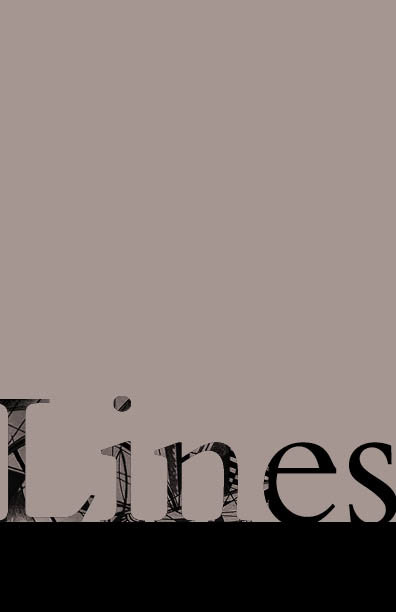
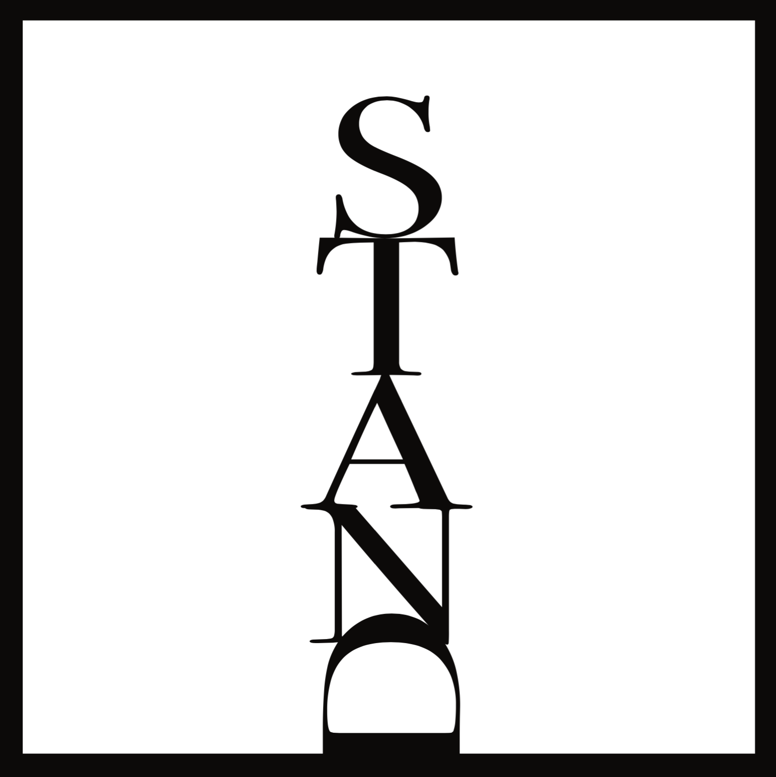
This series was about word play. I put together what would shape the meaning of that word.


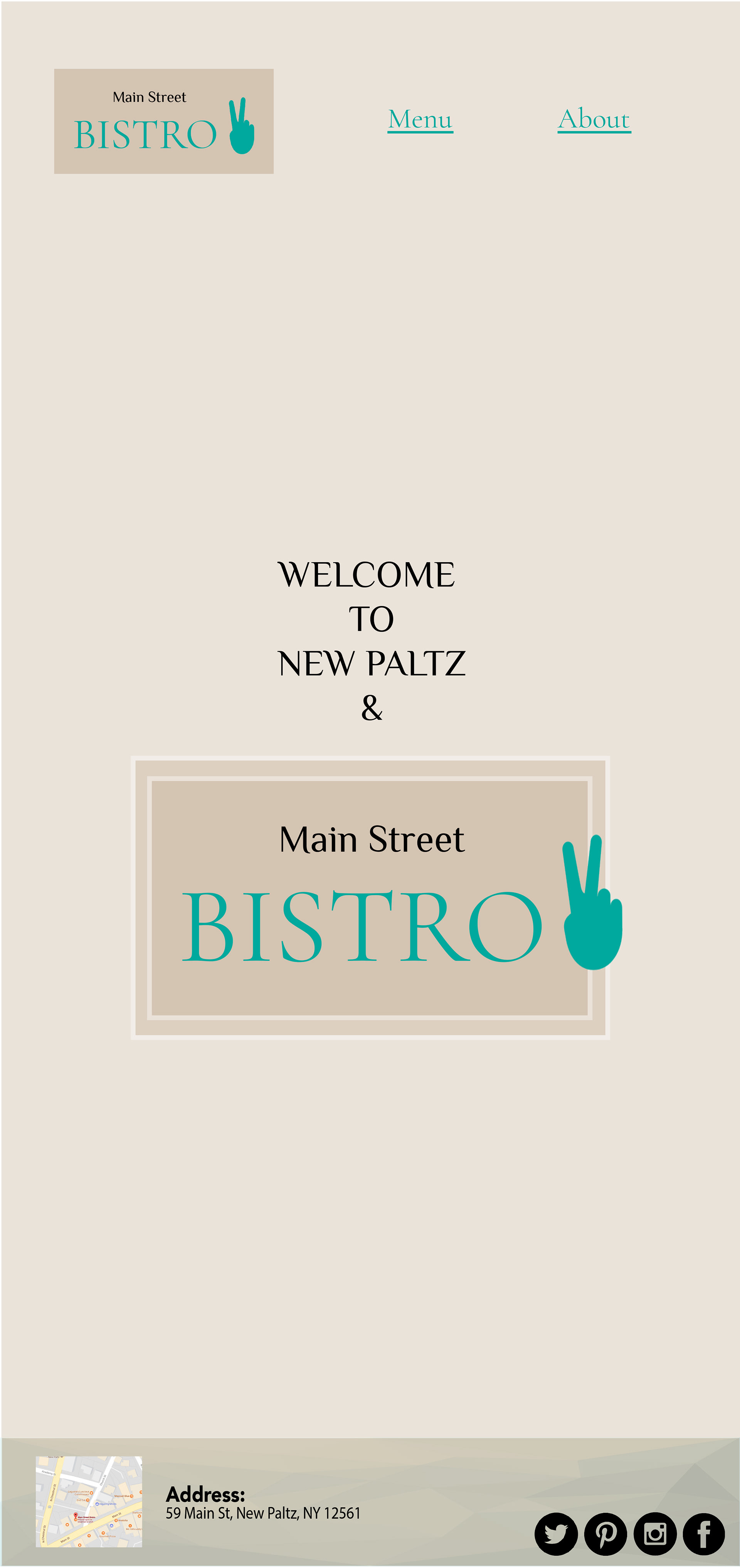
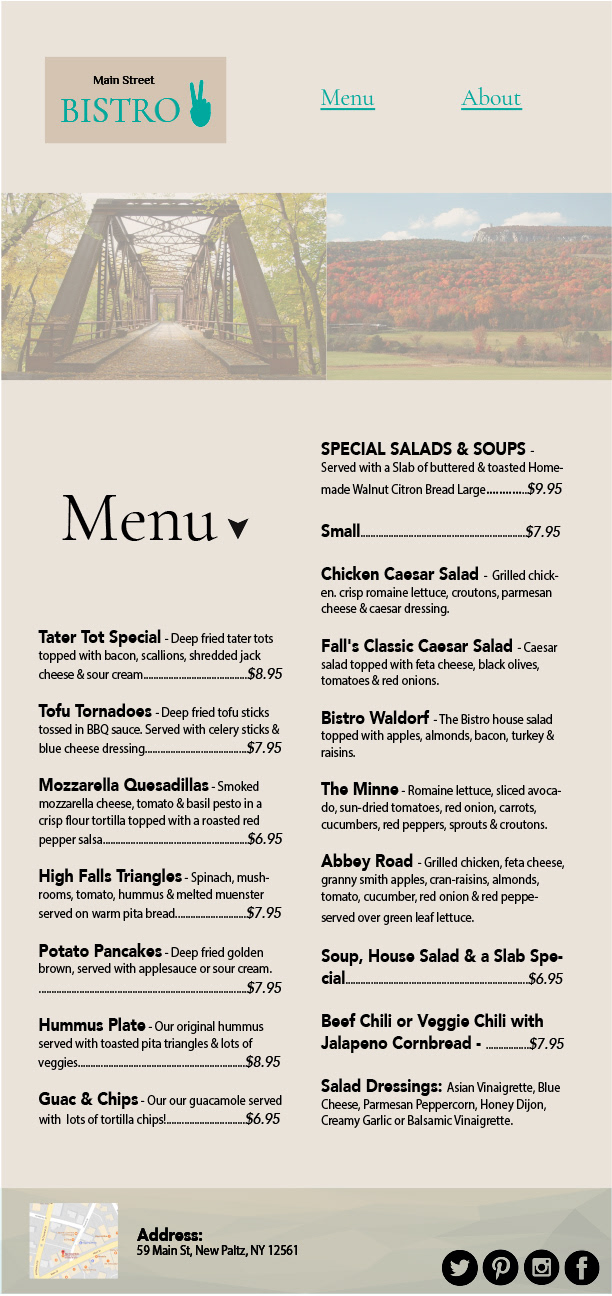
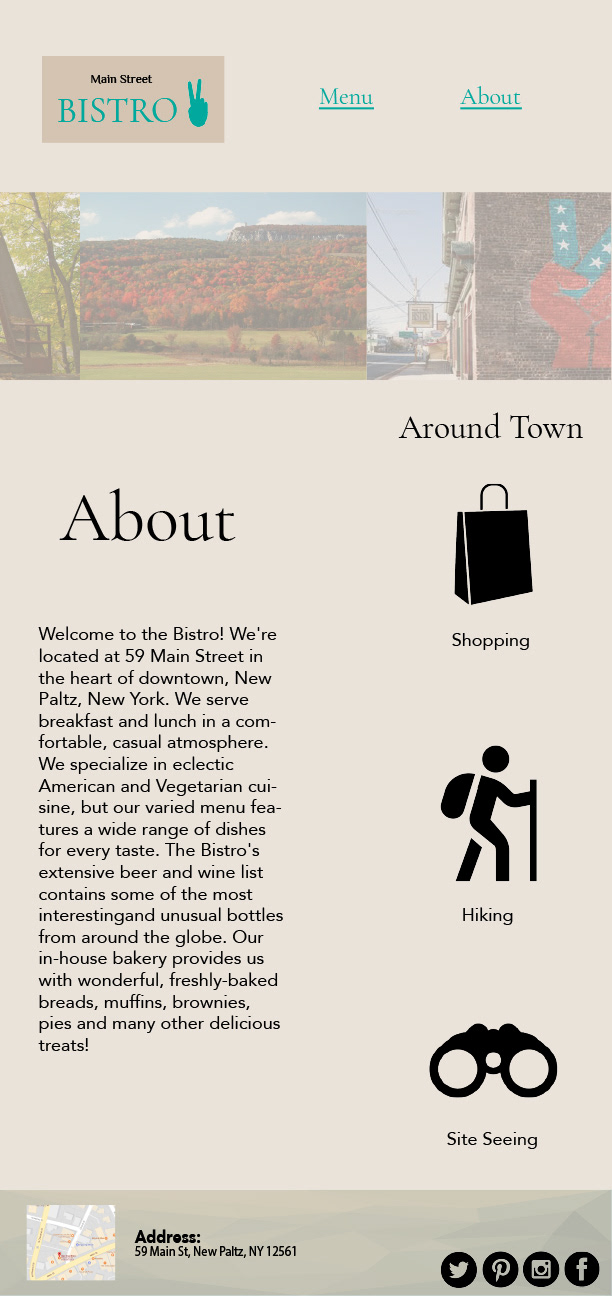
The next set are compositions that were put together for a popular spot in the town of New Paltz. The idea was to recreate the existing website that the restaurant already had. Incorporating the peace sign in the logo was important because it refers to a landmark in the town.
These were business cards made for the DASH Club. This club is associated with SUNY New Paltz. The computer lab and Dash Club taught students and faculty about different software programs. The interns picked the specialty and created a workshop to teach others.